Introduction
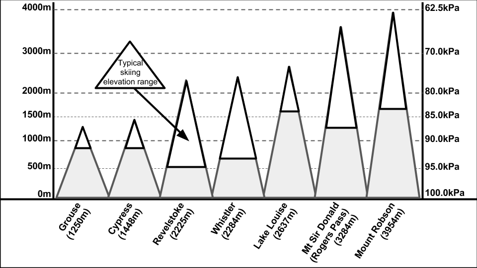
We know that as we travel higher in altitude, pressure decreases. As a result, temperature also decrease. Therefore, recorded the temperature at ground level would not be indicative of the temperature on the mountain at higher elevation. Pressure-level maps solve this issue as it analyzes the information at a certain pressure-level. Which pressure-level map depends on the elevation of the mountain. Figure 1 displays the association between pressure-level in kilopascal (kPa) and elevation in meters (m) as well as examples of local mountains and their place on the graph.
Figure 1. The association between altitude and pressure-level and local mountains in relation.
Temperature and Fronts
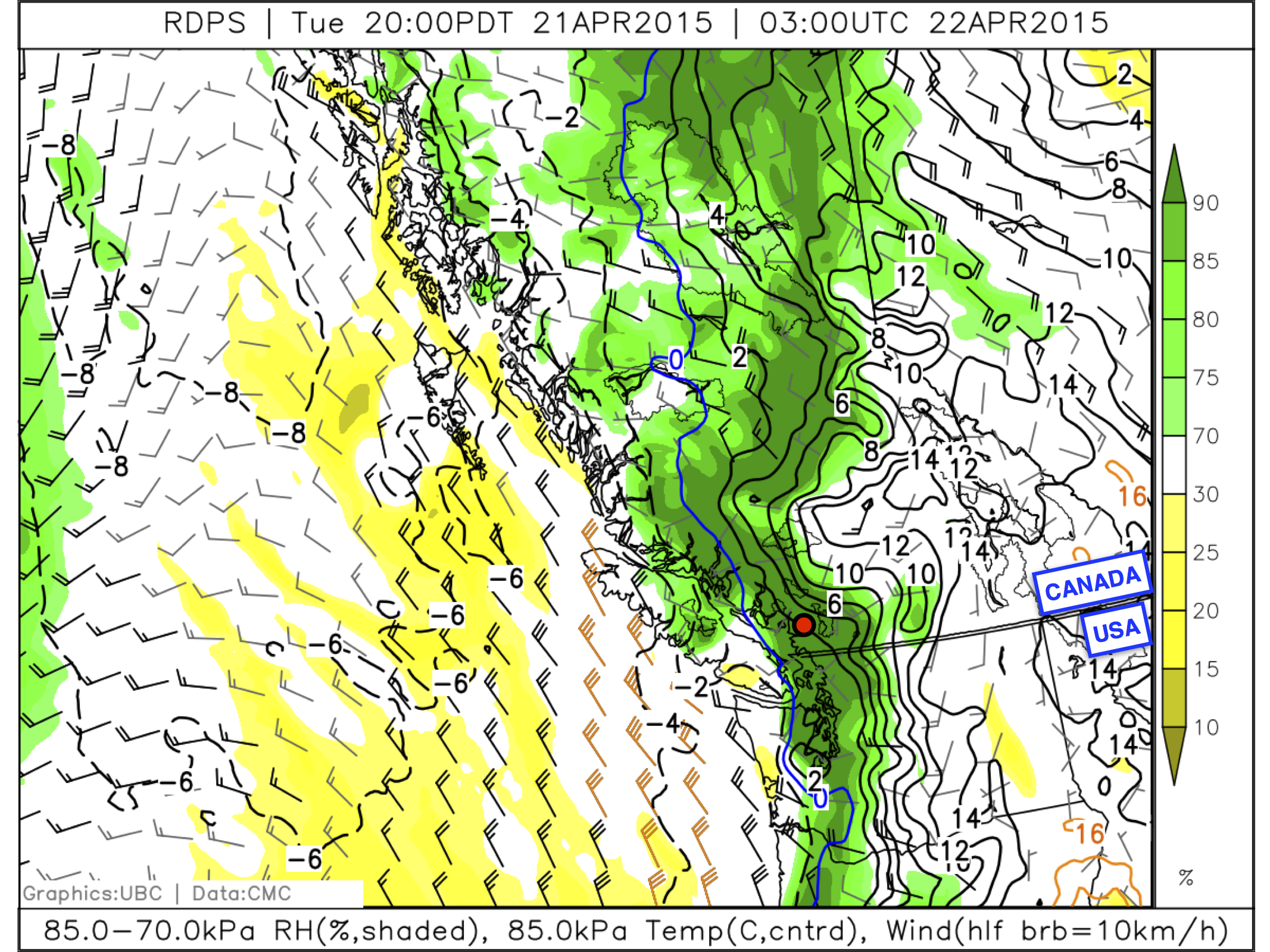
The black solid lines or dotted lines on pressure-level maps indicated areas with constant temperature. These lines are spaced out by every 2oC. An example of this can be seen in figure 2. The closer lines are, the stronger the temperature gradient and vice versa. Fronts can also be found using pressure-level maps. Further information about fronts can be found in "Background Information" section. In figure 3., the red circle indicates the front.
Figure 2.
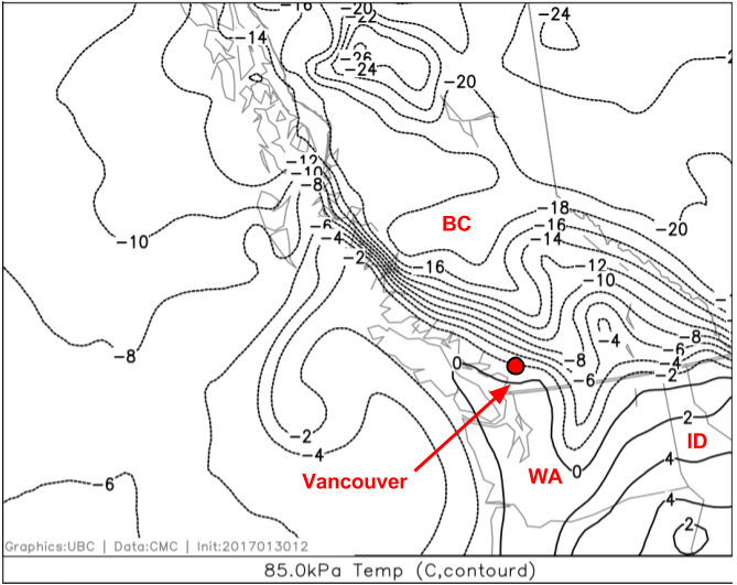
Figure 3.
Wind
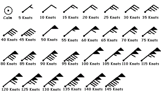
Some pressure-level maps include information about wind strength and direction like in figure 4. This is done using symbols called "wind barbs" as seen in figure 5. They are similar to arrows in that the area with line branching out are like feather and the shaft of the barb is like the arrowhead. This means the the shaft of the barb indicates the direction of the wind. The "feathers" of the barbs indicate the wind speed. A short "feather" signifies 5 knot or 10 km/h, a long "feather" symbolizes 10 knots or 20 km/h, and a triangle signifies 50 knots or 100 km/h. This is further shown in figure 5.
Figure 4.
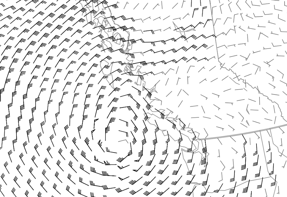
Figure 5.
Moisture and Visibility
Lastly, information about moisture can be found on pressure-level maps. Moisture is measured with relative humidity, which is essentially the percentage of the air is saturated. RH displayed using colours such as yellow and green as seen in figure 6. Areas with an RH around 70% or above will start to see cloud formation. Around 90%, fog will start to form. At 100%, the fog will become very thick and visibility will be very limited. In this conditions, it is very dangerous to go skiing or snowboarding.
Figure 6.
Reference
https://blog.mapbox.com/mapping-wind-barbs-to-show-speed-and-direction-4d3078add03dLinks to an external site.
https://www.eoas.ubc.ca/courses/atsc113/snow/met_concepts/05-met_concepts/05b-wind-from-pressure-maps/Links to an external site.
https://www.eoas.ubc.ca/courses/atsc113/snow/met_concepts/05-met_concepts/05c-moisture-from-pressure-maps/Links to an external site.
https://www.eoas.ubc.ca/courses/atsc113/snow/met_concepts/05-met_concepts/05a-temp-from-pressure-maps/Links to an external site.


 icons at the top right corner of the subsection.